Fast Shipping. Reliable Service. Every Time.

Get your machines and supplies delivered quickly because deadlines shouldn’t wait.

Frequently Asked Questions

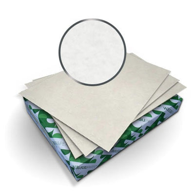
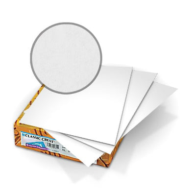
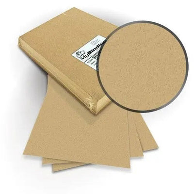
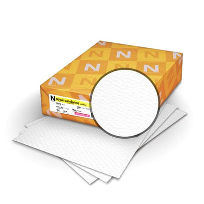
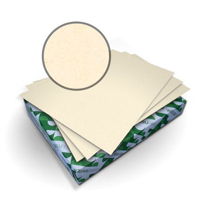
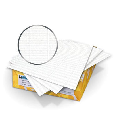
Specialty binding covers are chosen when the document needs a more polished texture, finish, or presentation feel than basic paper cover stock. Options include premium materials and finishes such as canvas texture, classic crest, felt, fiber, laid, smooth, soft touch, and other designer-style covers. These covers are useful for proposals, portfolios, certificates, menus, reports, and client-facing packets where the cover should support the message before the document is opened. The buying decision should focus on finish, color, thickness, and whether the cover needs to be punched. If the document only needs simple protection, broader binding covers may be enough.

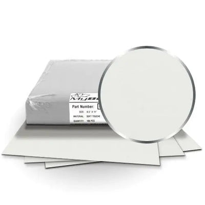
Choose soft touch covers when the finished document should feel more premium in hand. The soft surface can work well for executive packets, branded proposals, portfolios, invitations, and presentation materials where texture matters. Soft touch is more about feel and visual impression than heavy-duty protection, so it should be matched with the document’s audience. If the document will be handled constantly, also consider thickness and smudge resistance. A soft finish can make a simple design feel more refined, but it may not be the best option for rough daily use. Compare soft touch binding covers when tactile finish is a key part of the decision.

Designer covers are better when the cover itself should create the first impression. They work well for formal proposals, portfolios, event materials, and creative presentations. Clear covers are better when the printed title sheet should remain visible and easy to update. A clear front with a specialty back cover can also work if the front needs a visible title and the back needs more structure. The best choice depends on how the document will be introduced. If branding, texture, or color is important, compare designer binding covers. If the title sheet matters more, a clear cover may be the better front-cover choice.

Check cover thickness, material type, punch capacity, and binding style before punching. Specialty covers can be thicker or more textured than standard paper covers, so they may not punch cleanly if too many are loaded at once. Test one cover first with the actual machine and binding pattern. Comb, coil, wire, and other binding styles all require the correct hole layout. If the cover has a strong texture, make sure the punch side and finished orientation look right before running a full batch. A cleanly punched specialty cover makes the document look intentional, while rough holes can make even premium material feel poorly finished.

Match the cover to the brand tone, document purpose, and expected handling. A smooth or soft-touch finish can feel modern. Felt, laid, or classic textures can feel more formal or traditional. Dark colors may suit executive reports, while lighter textures can work for proposals, event packets, or creative portfolios. If a logo, foil, label, or printed title will be added, test contrast before ordering. Texture can affect readability, especially with fine details or small labels. For high-visibility projects, order samples or create one finished mockup with the chosen spine and cover. The cover, spine color, and printed design should work together.

Featured Blogs

View all
Binding101 2018 Best Sellers

Binding101 2018 Best Sellers

Here is a list of our top-selling equipment for 2018, across all product categories, by volume of...

Read More
DIY Booklets: How to Make Event Programs, Catalogs, & Magazines

DIY Booklets: How to Make Event Programs, Catalogs, & Magazines

From handmade zines to polished product catalogs, folded and bound booklets are a classic way to share...

Read More
How to Make Custom Calendars: A Step-by-Step Guide

How to Make Custom Calendars: A Step-by-Step Guide

Custom calendars aren’t just great for organization — they’re also an excellent product line for small businesses,...

Read More